
Market Share for Mortgage - User Experience
Step | Instruction | Details | |
|---|---|---|---|
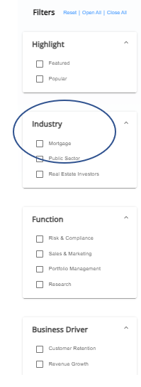
1 | Select Your Industry | Click on Discovery Solutions on the Unified Portal, then select your industry from the drop-down menu (Mortgage). | |
 | |||
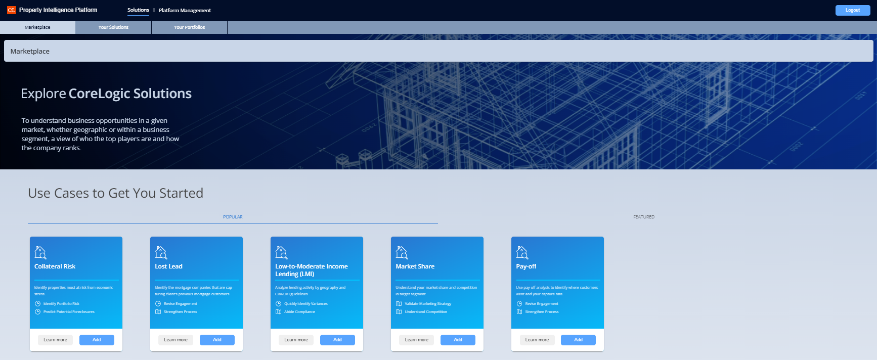
2 | Select the Use Case from the Marketplace |
| |
 | |||
3 | Edit or create your Scenario | You can create a new Scenario (or select a previous Scenario and edit it.) Complete the fields below. Fields with an asterisk are required:
| |
-20230906-164143.png?inst-v=f41c3a66-ac8d-463d-bda6-35cb316a71a6) | |||
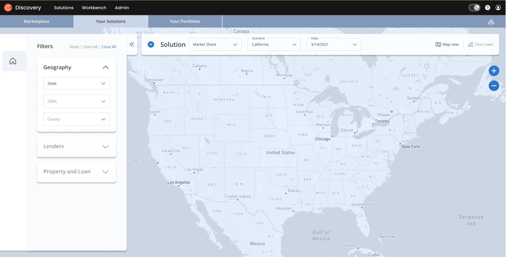
4 | Map View | Your Solution will appear in Map View.
| |
 | |||
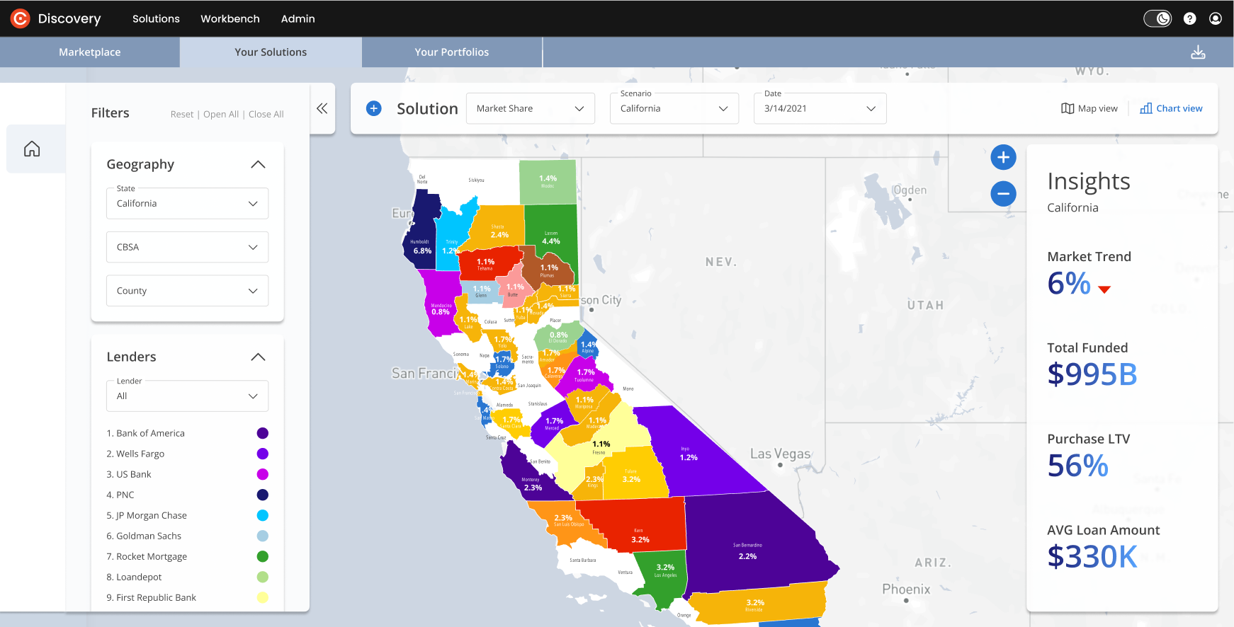
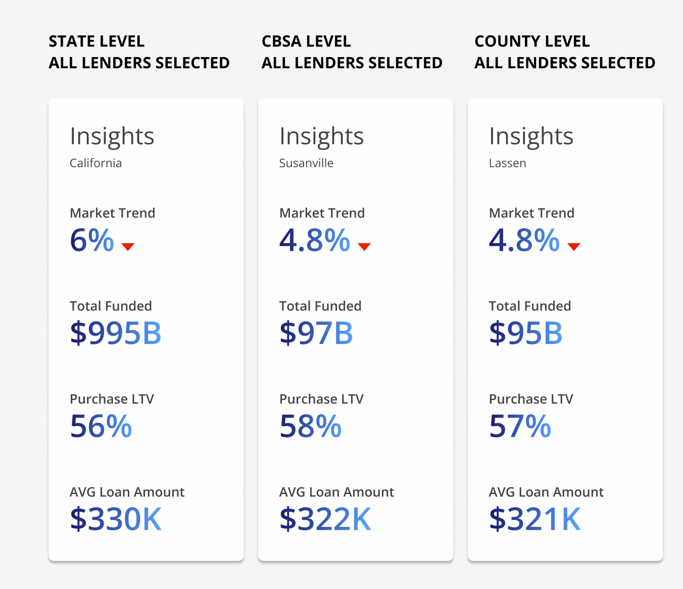
5 | Filters: All lenders | Once you select a State, the map will present information about the selected state. Filters panel: The default filter is all lenders. The top 15 lenders will appear with their own color assigned. The map reflects the top lender in each county. Insights panel: The Insights include:
If a specific lender is not selected, then Market Trend data will be displayed on a State level. | |
 | |||
6 | Filters: Lenders |
| |
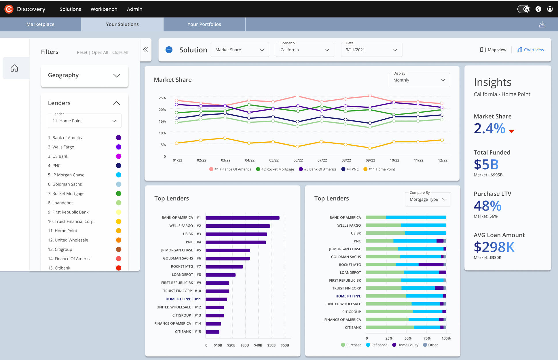
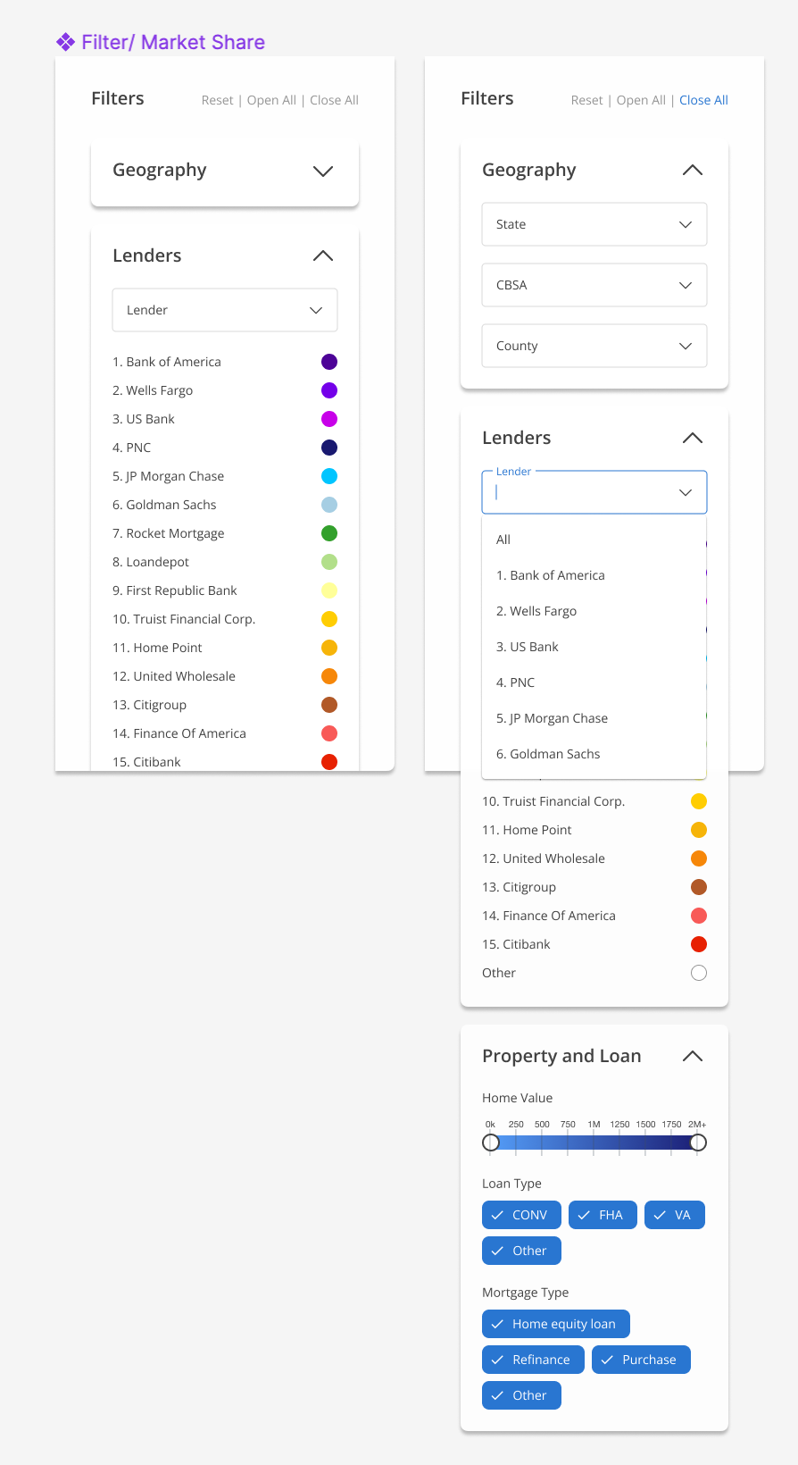 | |||
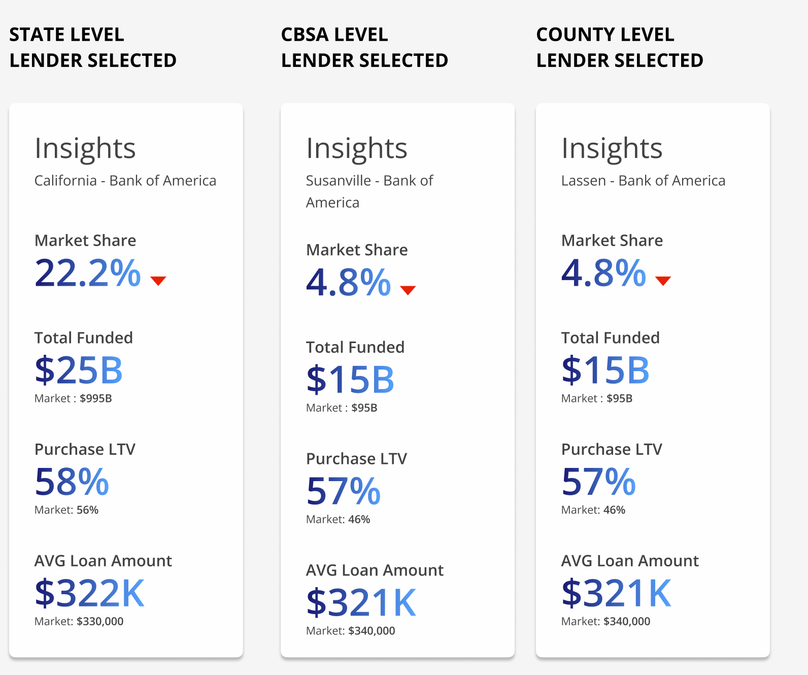
7 | Insights Panel Variations with and without a selected lender | All Lenders Selected: If you are looking at “All Lenders” in the filter panel, you will see general “Market Trend” Key Performance Indicators (KPIs) for the area you have selected. Specific Lenders Selected: The Insights panel is dynamic and should be affected by your selected filters. | |
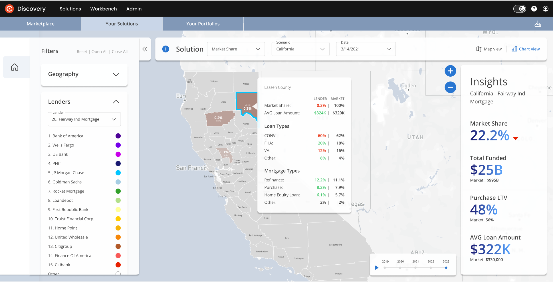
  | |||
8 | State > All lenders > County tooltip | Filter panel:
| |
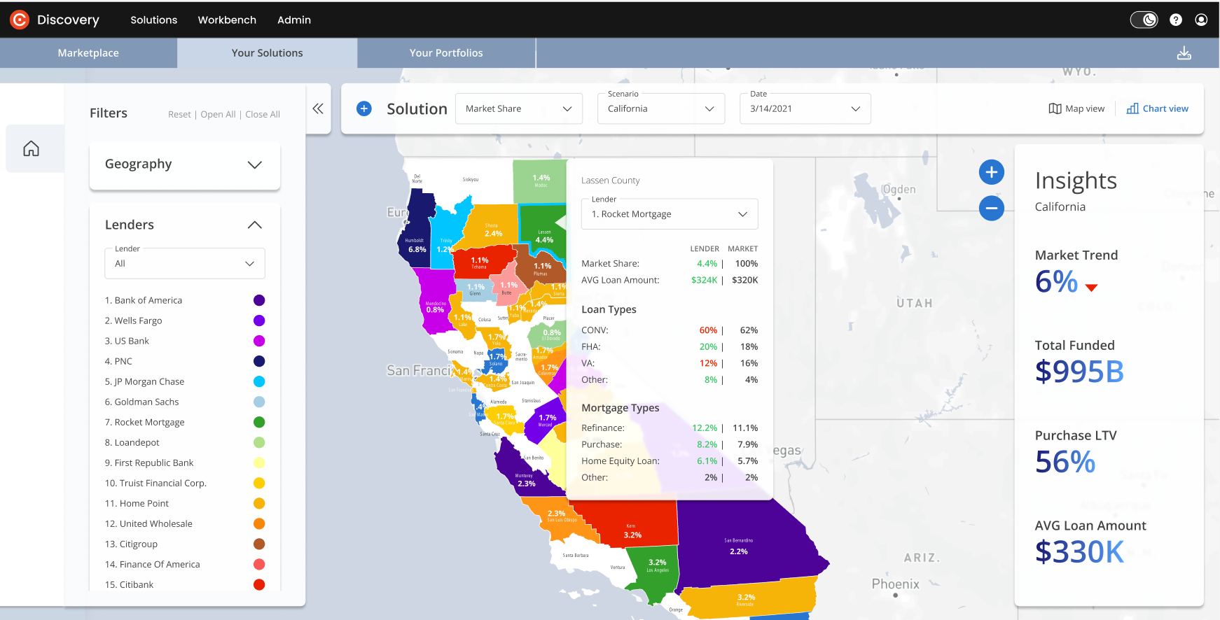 | |||
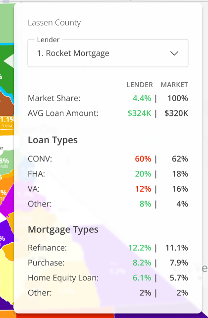
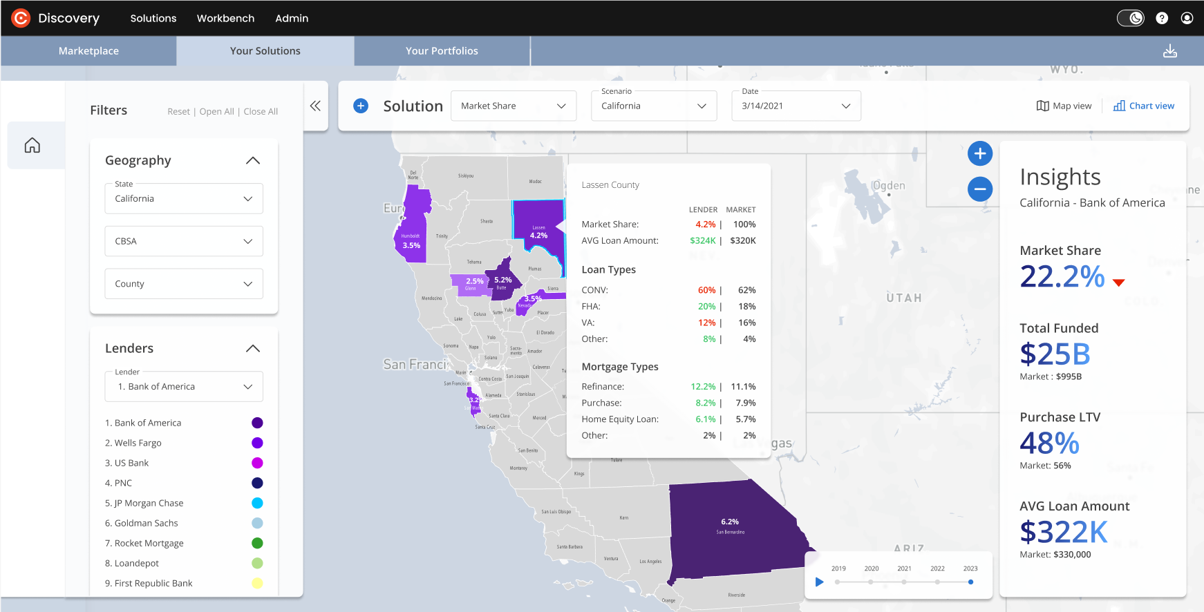
9 | County tooltip > All lenders | You can use the County tooltip Lender dropdown to switch between lenders.
| |
 | |||
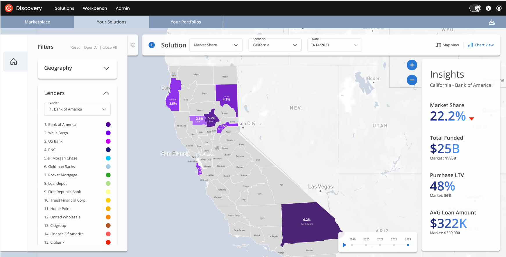
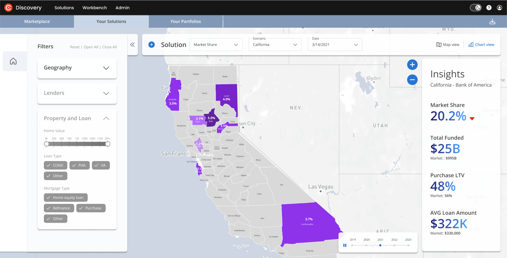
10 | State > Lender selected | Filter panel: This view shows the state view with the Lender (Bank of America) selected in the dropdown. Map: The map will highlight only areas with the selected lender. The higher the market share - the darker the color. Insights: The market share of the selected lender is displayed, along with their Total Funded loans, Average Interest Rate and Average Loan Amount. Trends overview: An interactive panel is visible when 1 lender is selected, showing trends over time. Click on the play arrow to review. | |
 | |||
11 | State > Lender selected > Trends overview |
| |
 | |||
12 | State > Lender selected > County tooltip |
| |
 | |||
13 | State > Lender outside top 15 selected |
| |
 | |||
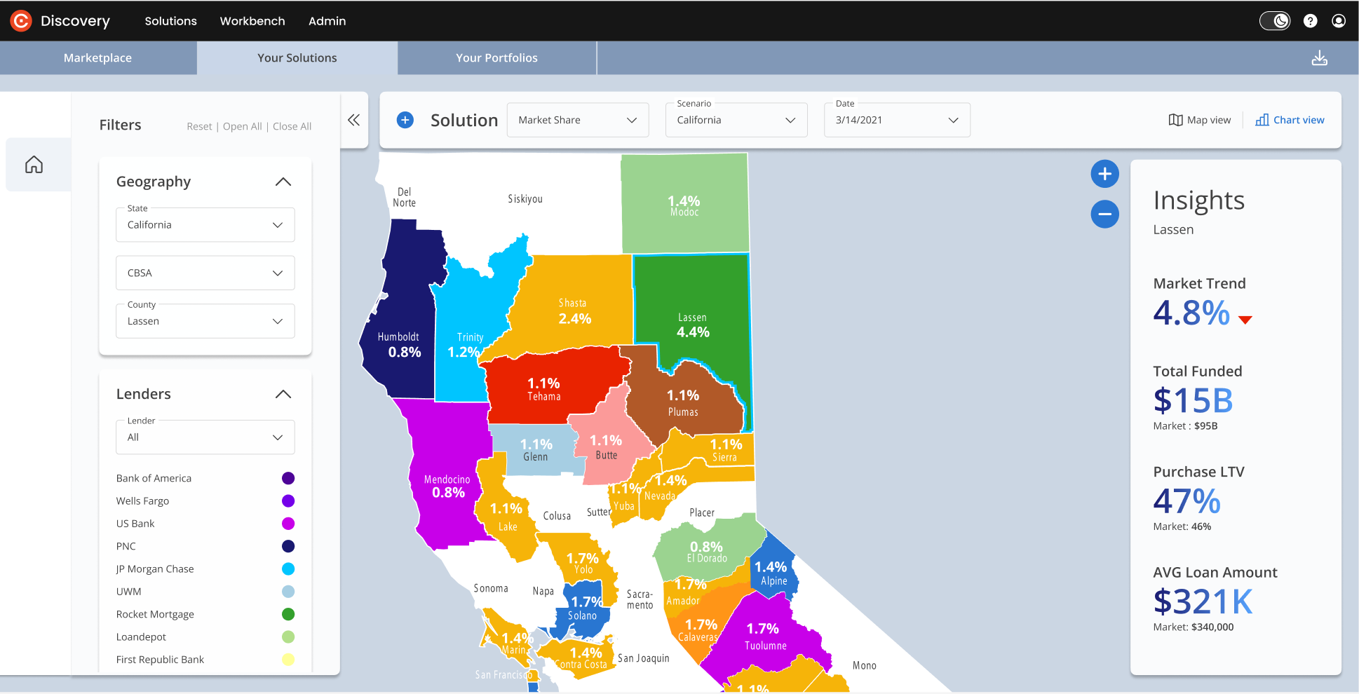
14 | County selected > All lenders |
Insights: If All lenders are selected the Insights panel will reflect information about all lenders in the selected county. | |
 | |||
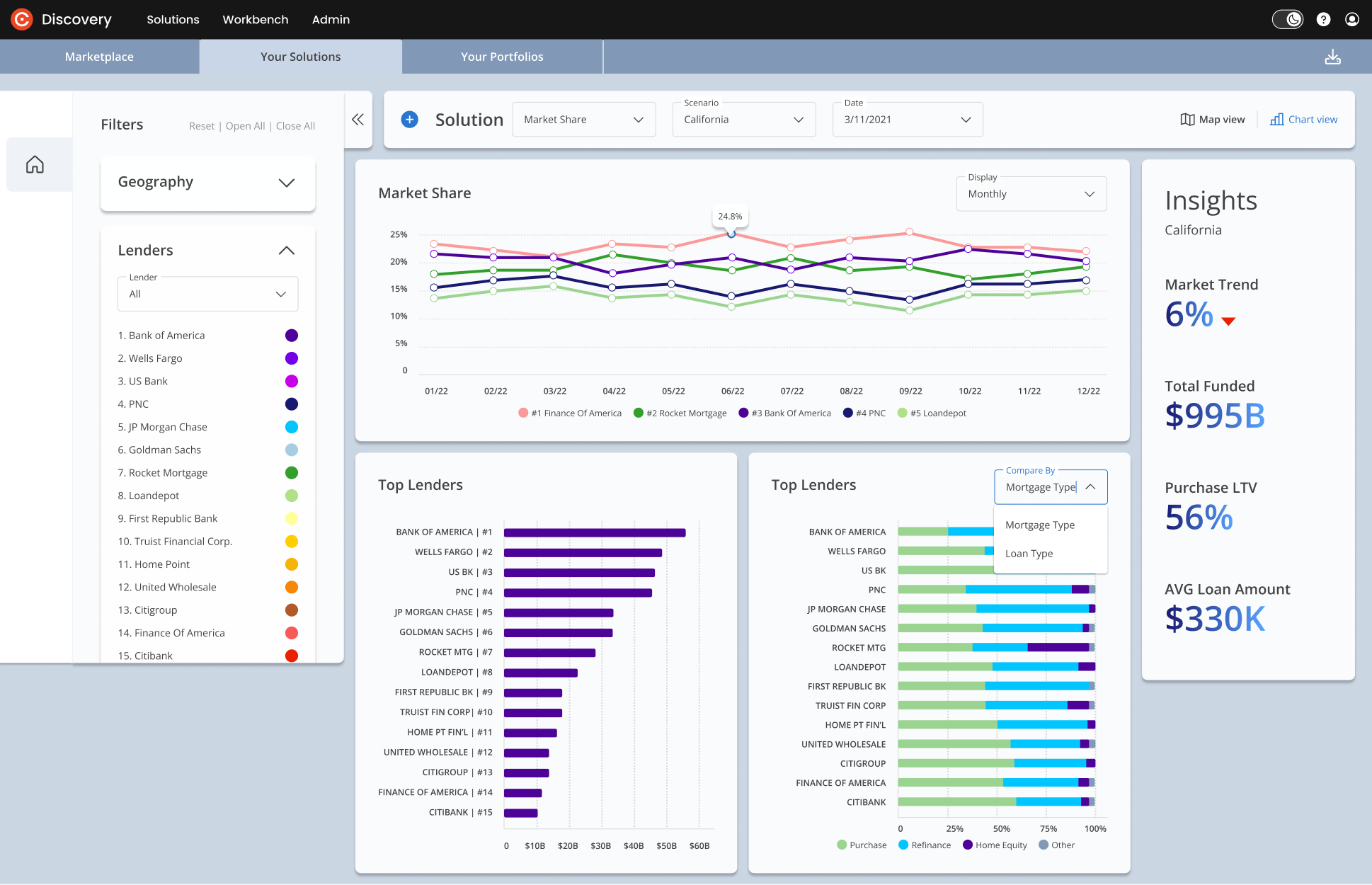
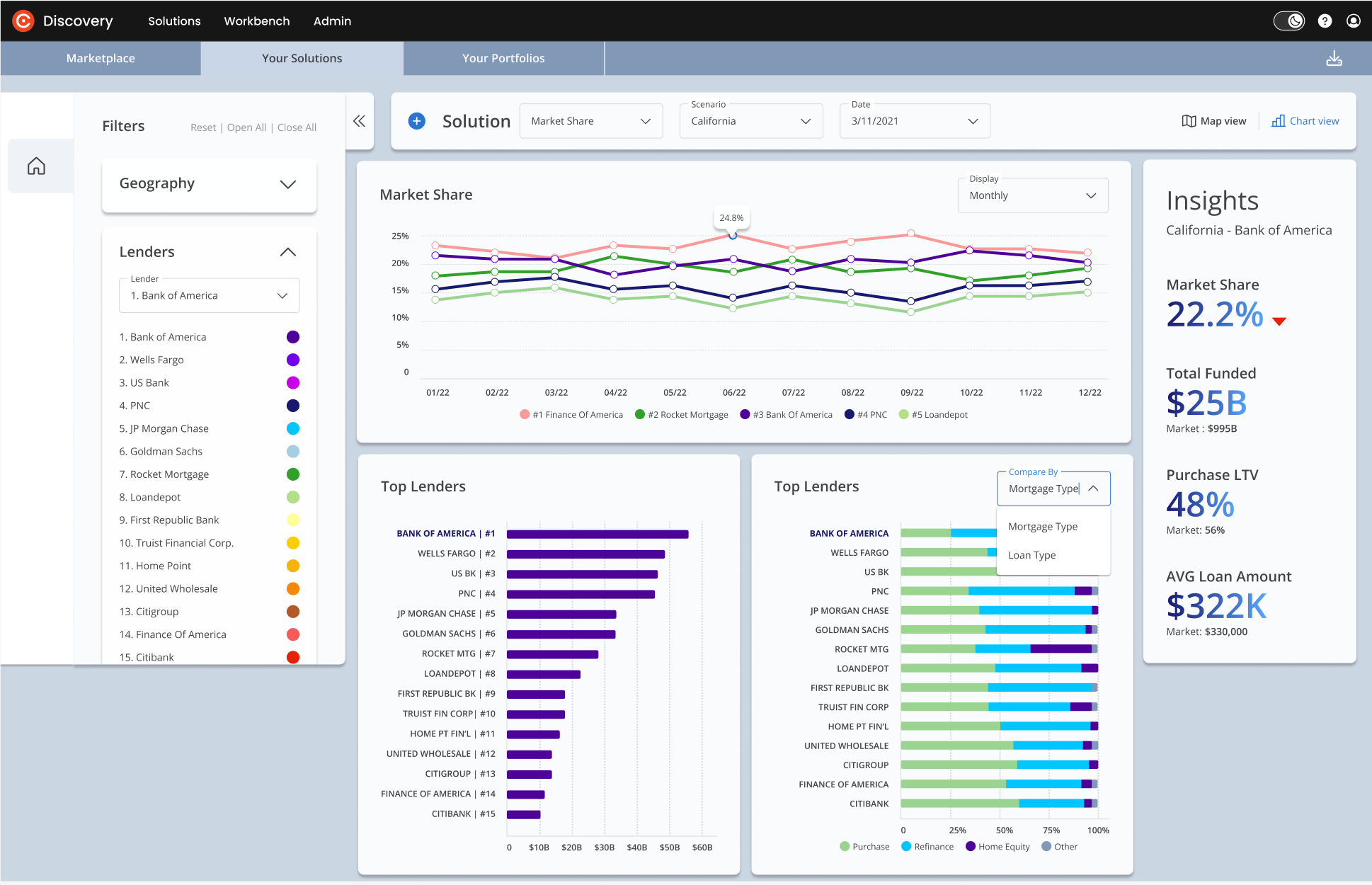
15 | State > All lenders > Chart view | You can switch from Map view to Chart view on the upper right of your screen. This Chart view represents information about Top lenders in the selected State (California). The panels reveal:
| |
 | |||
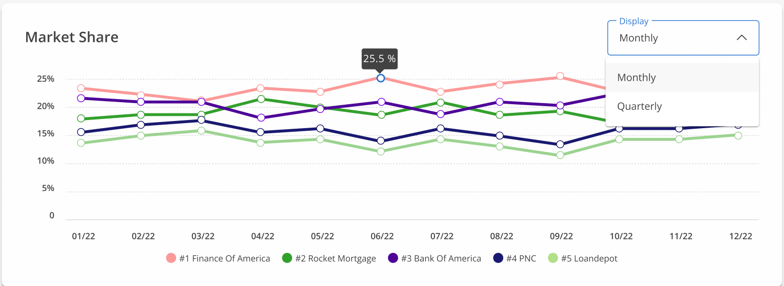
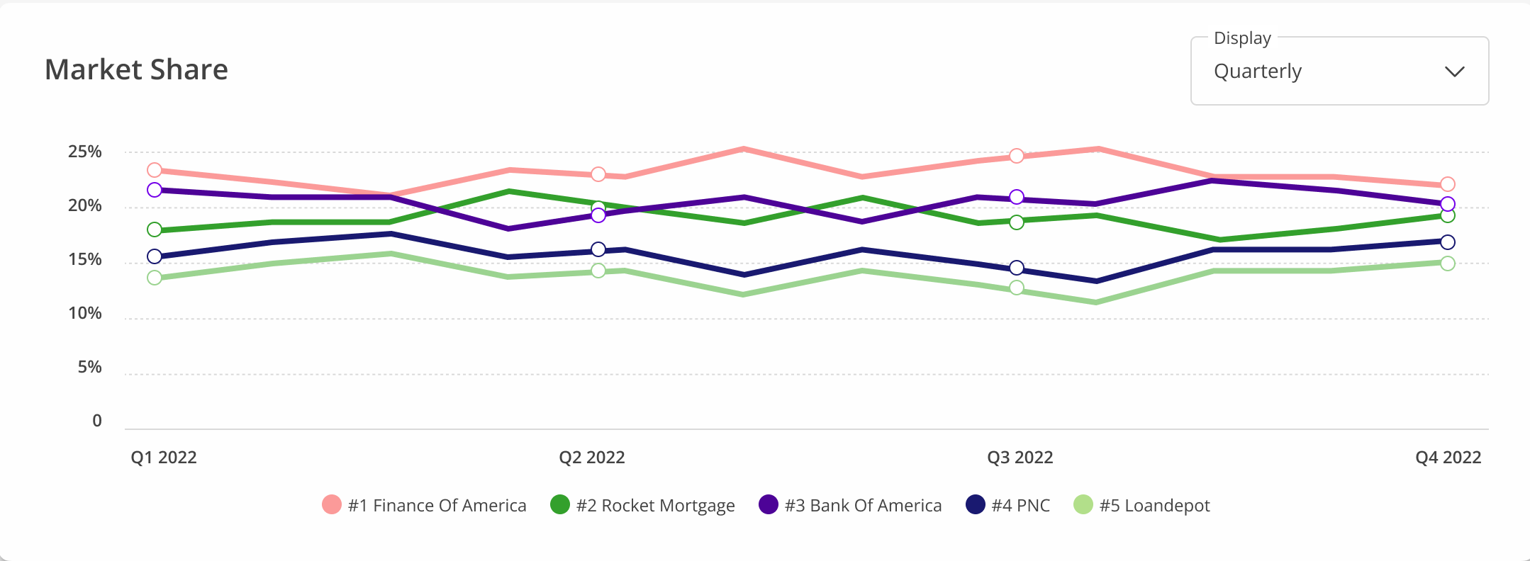
16 | State > All Lenders > Chart view > Market Share | You can switch between monthly and quarterly views of Market Share. | |
  | |||
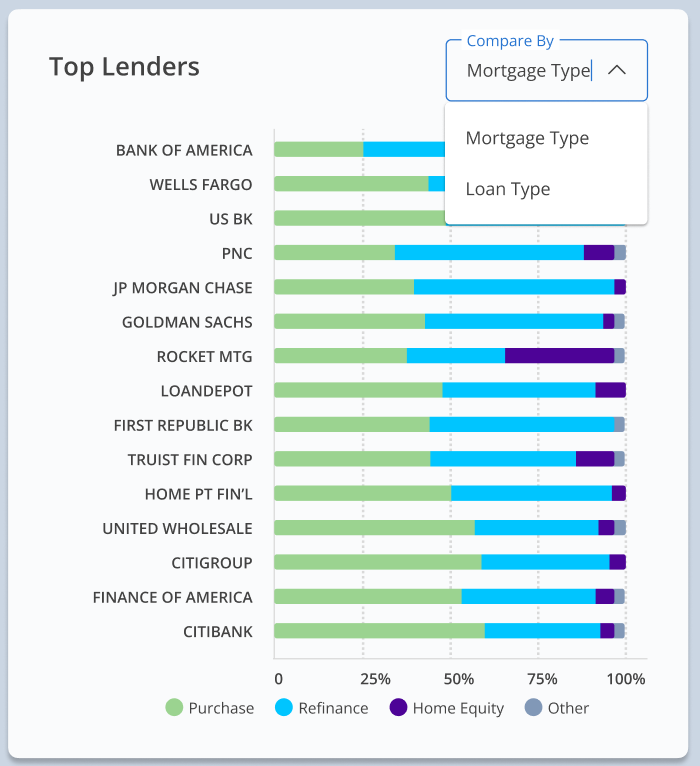
17 | State > All lenders> Chart view > by Mortgage | In the Top Lenders panel, use the dropdown menu to switch between charts. Top Lenders by Mortgage type: Bars represent % of each mortgage type per lender. | |
 | |||
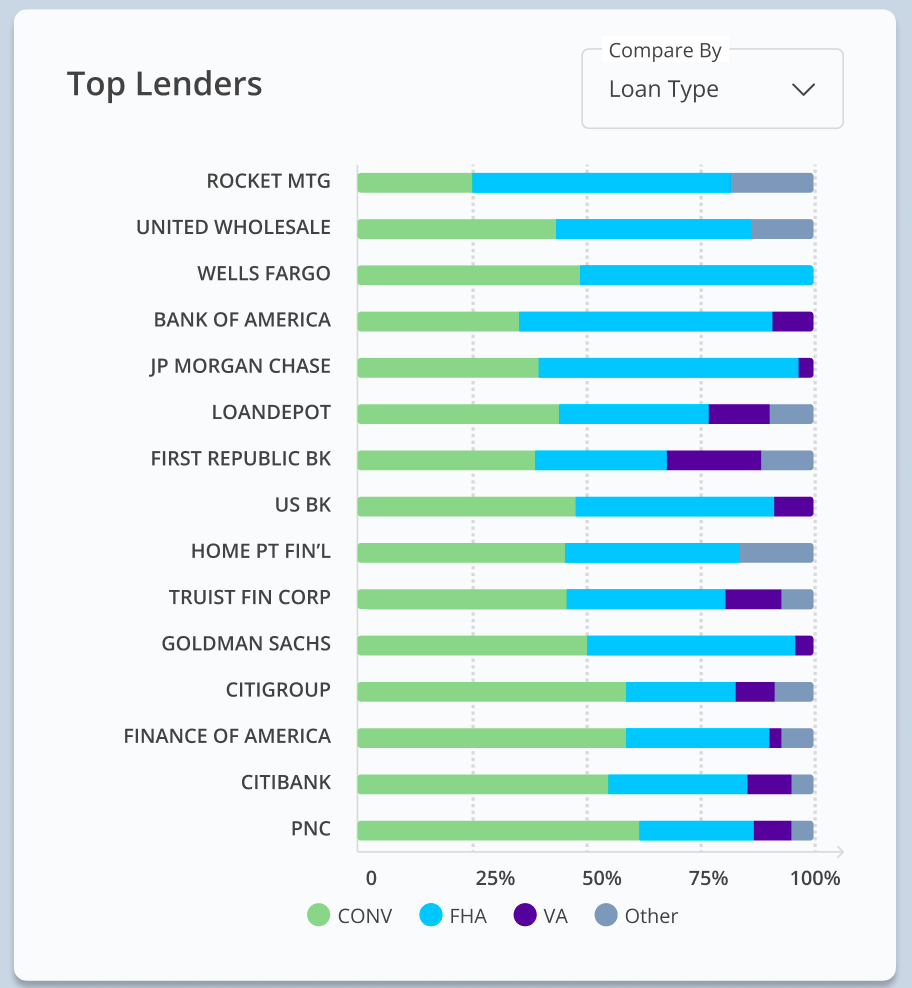
18 | State > All lenders > Chart view > by Loan type > All | Top Lenders by Loan Type: There 4 are loan types:
| |
 | |||
19 | State > Lender selected > Chart view | Select a lender to view their details in Chart view.
| |
 | |||
20 | State > Lender selected > Chart view > Market share |
| |
 | |||
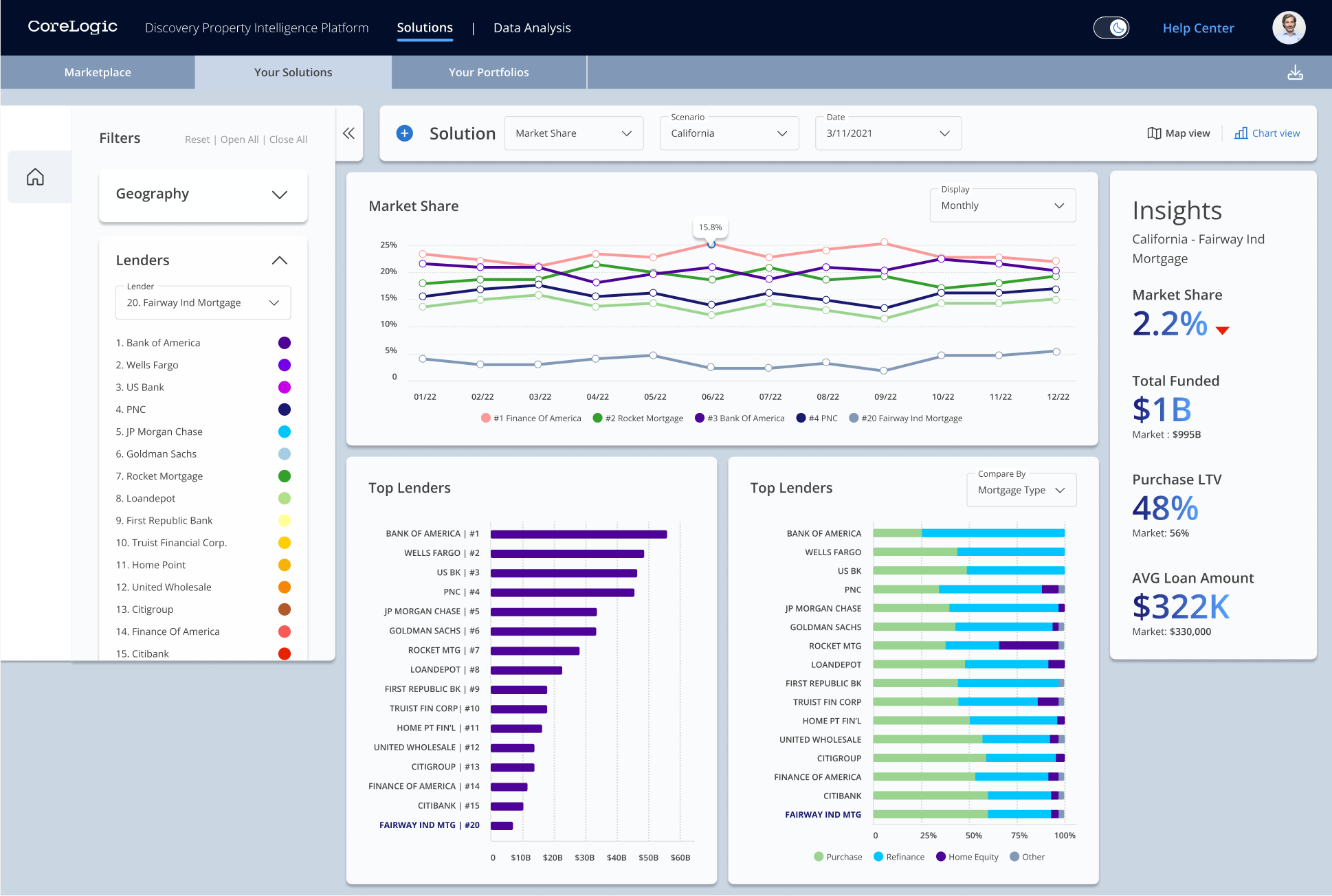
21 | State > Lender selected (outside top 15) > Chart view | If you choose a lender that isn't in the top 15, the lender will be highlighted and appear at the bottom of the chart (e.g., #20 Fairway Ind Mortgage.) | |
 | |||
22 | County > Lender selected > Chart view | When the county and lender are selected, the name of your lender will be highlighted in dark blue. The panels will show:
| |
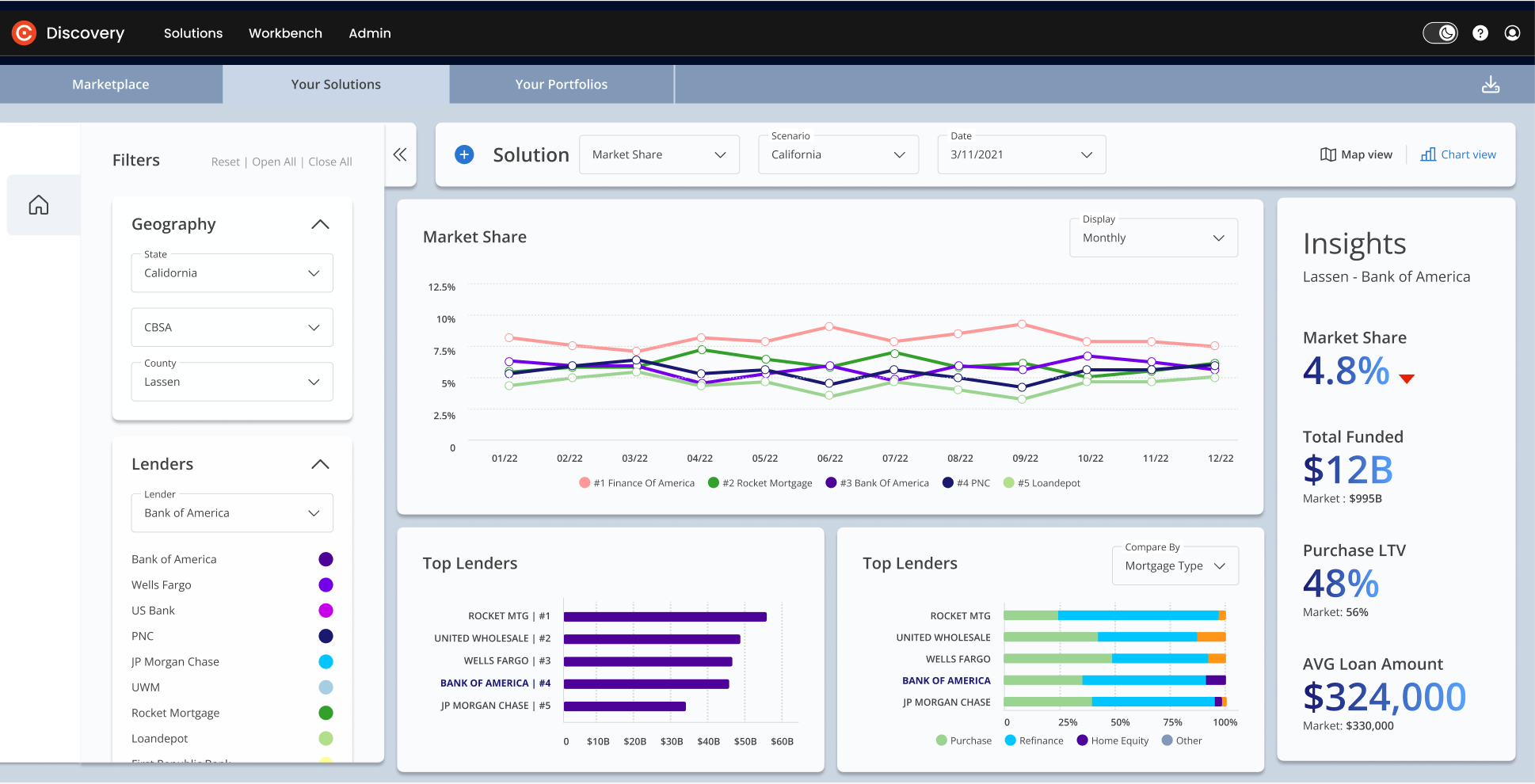 | |||
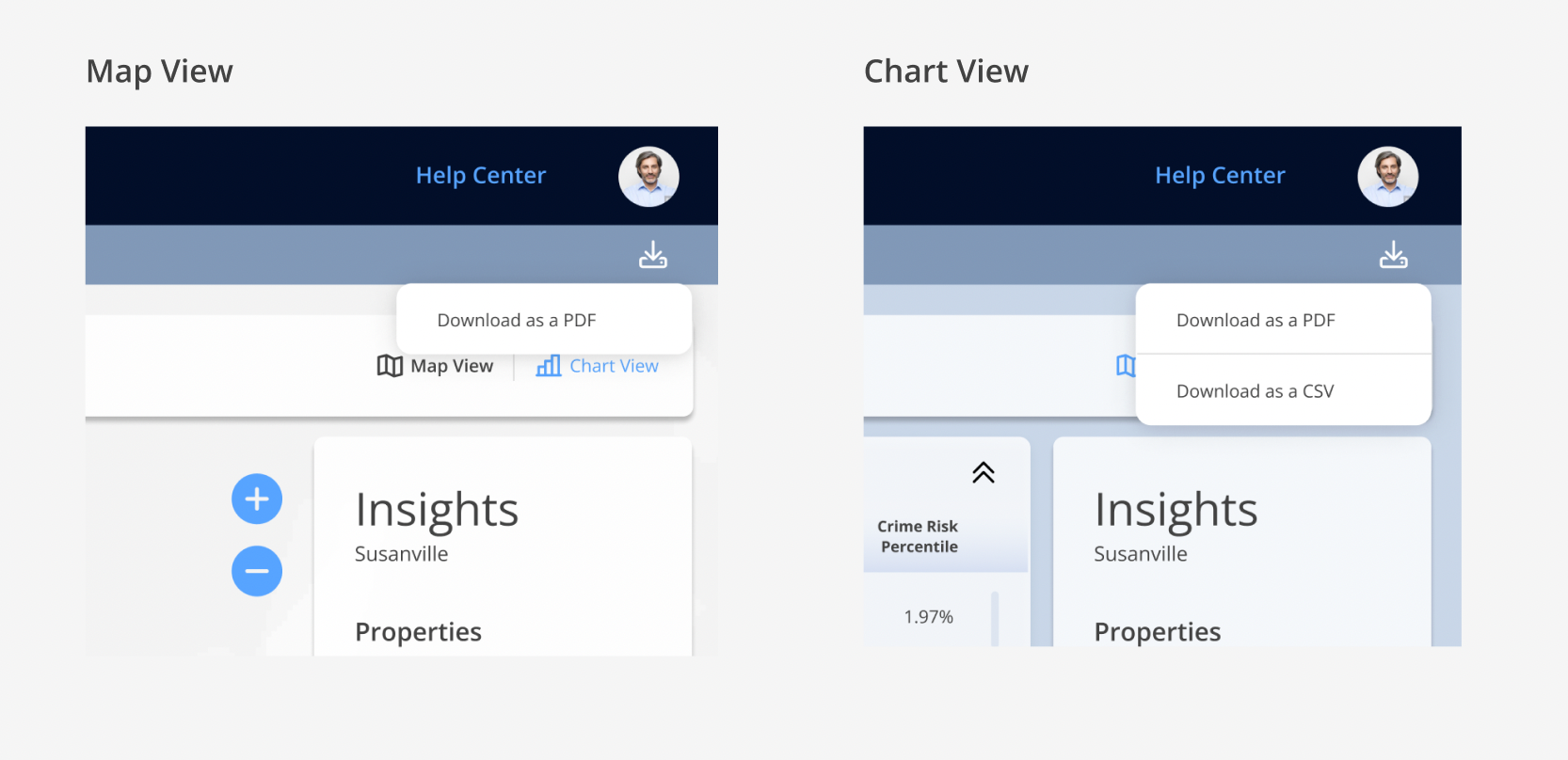
23 | Export | You can download your solution using the export icon on the top right of your screen. The content of the Map View and the Chart View can be exported in separate files.
| |
 | |||
Ready to get started? Click here.